Decide on your typography
Fonts evoke emotions and atmospheres. It's key to have a clear typographic hierarchy for good communication. Now, we will look at the vibes different fonts convey. We will also discuss how to define a basic structure. This structure includes three levels of headings and paragraph styles. It makes text easier to read and more appealing.
Typeface Styles and Their Emotional Impact
Serif Fonts
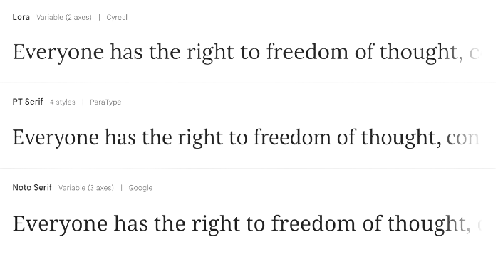
Serif fonts have small lines or strokes that attach to the end of a larger stroke in a letter or symbol. Examples include Times New Roman and Georgia. These fonts are often perceived as traditional, reliable, and formal. They are common in print media, like newspapers, books, and academic publications. They give a sense of authority and credibility.
Sans-Serif Fonts
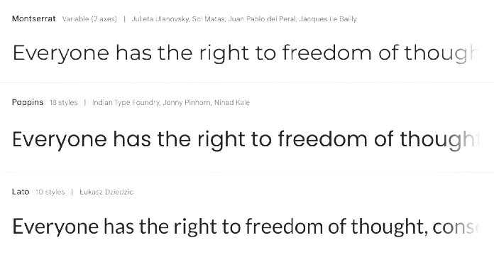
Sans-serif fonts, such as Helvetica and Arial, lack the small projecting features at the ends of strokes found in serif fonts. These fonts embody a modern, clean, and approachable style. They are versatile and widely used on digital platforms. They are used for body text and headings. They provide great readability and a modern feel.
Script Fonts
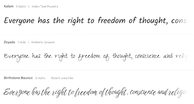
Script fonts mimic cursive handwriting. They can range from fancy to casual. They are often used for invitations, branding, and display. They add flair or individuality. However, due to their ornate nature, they are less suitable for body text as they can reduce readability.
Defining Basic Typographic Structure
Creating a typographic hierarchy is essential. It guides readers through your content in a logical and pleasing way. I recommend a simple structure. It typically has three levels of headings and a style for paragraphs.
Headings
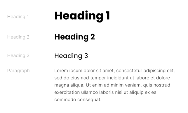
• H1 (First-level Heading): This is the largest and most prominent heading, used for main titles. It should be impactful and set the tone for the entire piece.
• H2 (Second-level Heading): Used for main section titles, it is smaller than H1 but still significant. This heading helps to organize content into manageable sections.
• H3 (Third-level Heading): This heading is used for subsections within H2 sections. It is subtler yet still distinct from body text, guiding readers through detailed groupings of content.
• H3 (Third-level Heading): This heading is used for subsections within H2 sections. It is subtler yet still distinct from body text, guiding readers through detailed groupings of content.
Paragraphs
• Paragraph Style: The style for paragraphs should ensure excellent readability. Choose a font size that is comfortable to read on the intended medium (print or digital). Line and paragraph spacing should be adjusted. This will make the text easier to read and more attractive.
Basic example of defining your typography
I usually freestyle on my first design to get the right proportions and hierarchy in the visual. Afterwards, I save the typographic styles I have used for future designs. Chances are that if it worked on one layout, it will work on other variations as well.
Now, when creating designs, you no longer have to choose from 58 different font sizes, which often leads to analysis paralysis. Instead, you'll have a clear structure with predefined sizes and styles. This approach allows you to quickly select the appropriate font size and style from a well-organized set, speeding up the design process tremendously.
Cutting these decisions lets you focus on creative and efficient design work
