Create product thumbnails
Thumbnails act as the visual gateways to your digital content. Whether for a video, an eBook, or a blog post, a well-designed thumbnail can significantly increase engagement by attracting viewers and encouraging clicks. This chapter explores the essentials of crafting thumbnails that are not only visually appealing but also effective in conveying your content’s unique value proposition.
Keep It Simple
The key to an effective thumbnail is simplicity. Avoid cluttering the space with too much text or too many images. Each element should serve a clear purpose. Your thumbnail needs to be easily understood at a glance, as it often appears as a small image amidst a sea of other visuals.

Good examples

Bad examples
1. Place the Visual
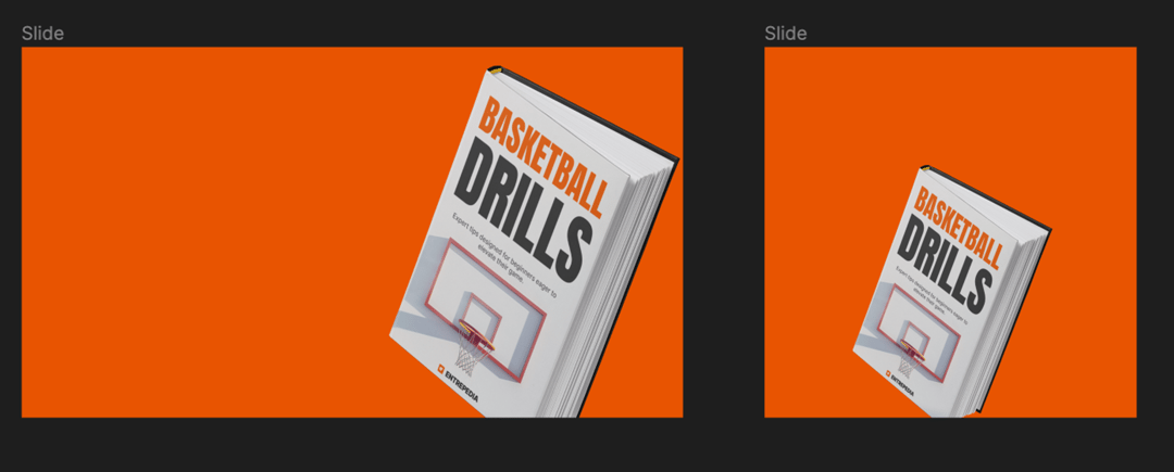
In previous chapters, we have worked on creating great visual. Place it into a thumbnail to be the most prominent element

2. Place your content
a. Title
Craft a title that captures the essence of your content. This should be compelling enough to catch the viewer's attention and make them want to click to learn more. The title should be concise yet descriptive, effectively summarizing the video or article behind the thumbnail.
b. One-liner
Supplement your title with a one-liner that further explains your unique value proposition. This additional text should provide just enough detail to intrigue your audience and clarify what makes your content valuable or different from others in the same category.
c. Call to Action
Always include a call to action (CTA) in your thumbnail. This could be as simple as a visual prompt like a play button, or text such as "Get it now" or "Learn." The CTA should be prominent and clear, effectively guiding viewers towards the next step you want them to take.

📐 Align Elements Together
Ensure that all elements are aligned cohesively. This creates a clean, organized look that enhances readability and visual appeal. Utilize grids and alignment tools in your design software to keep your text, imagery, and other components neatly arranged.
👁️ Apply Visual Design Principles for Clear Hierarchy
Use design principles such as contrast, hierarchy, and balance to structure the layout of your thumbnail:
• Contrast can be achieved through color choices and font sizes that make the most important elements stand out.
• Hierarchy guides the viewer's attention across the thumbnail, from the most to the least important information.
• Balance ensures that the thumbnail is not visually overwhelming on one side than the other.
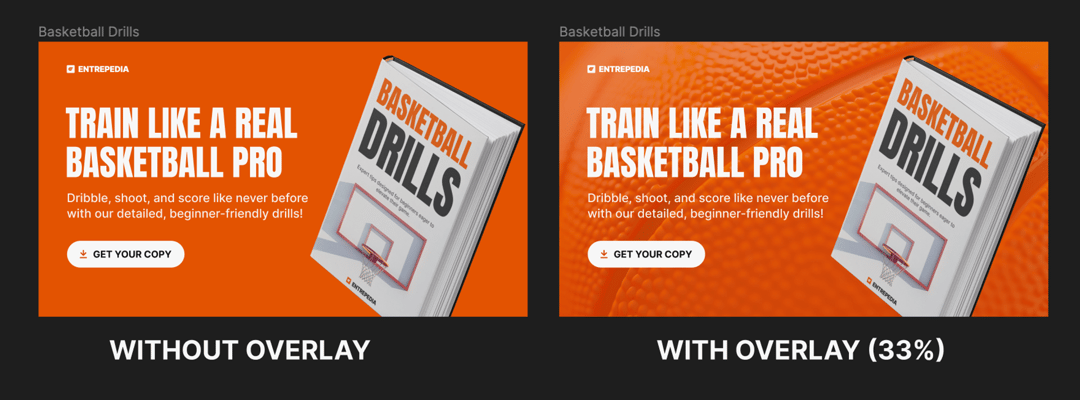
3. Add textured background
If the visual feels boring to you, you can try adding a texture to background and make it more alive. In the Midjourney chapter, we have generated a ball close-up which will work perfectly for this.
When adding textures, make sure that all your text remains legible. If the texture adds too much noise, an easy trick is to put a solid color overlay with decreased opacity. You can still see the texture, but text becomes much more readable.

Finishing up
Thumbnails are a critical element of your digital product strategy. By following these guidelines, you can create thumbnails that not only look great but also perform well, driving engagement and effectively communicating the value of your content. Remember, a thumbnail is often the first point of contact with your audience—make it count.
This could have taken you some time, however remember, that from now on, the entire process will be way faster. You have your own prompt templates, design guidelines and first design that you can use as a base to build more from here. Congratulations, you are now officially a professional visual designer!


