Basics of design
Typography is a key part of design. It does much more than make text readable. Different fonts can convey different moods. They're crucial for making a quick and strong impression.
You have to know how to pick the right typefaces. They should reflect your brand's personality and its message. For instance, serif fonts suggest tradition and reliability and on the other hand, sans-serif fonts presents you as modern and friendly.
Combining the right fonts enhances communication. It ensures the first look matches users' expectations. This draws them into the content.

Choosing the font matters
Composition in design determines the placement of elements on a page. It guides the viewer's eye and emphasizes key messages. You can achieve effective composition through a strong visual hierarchy. It organizes and prioritizes content, making it easy to understand and appealing.
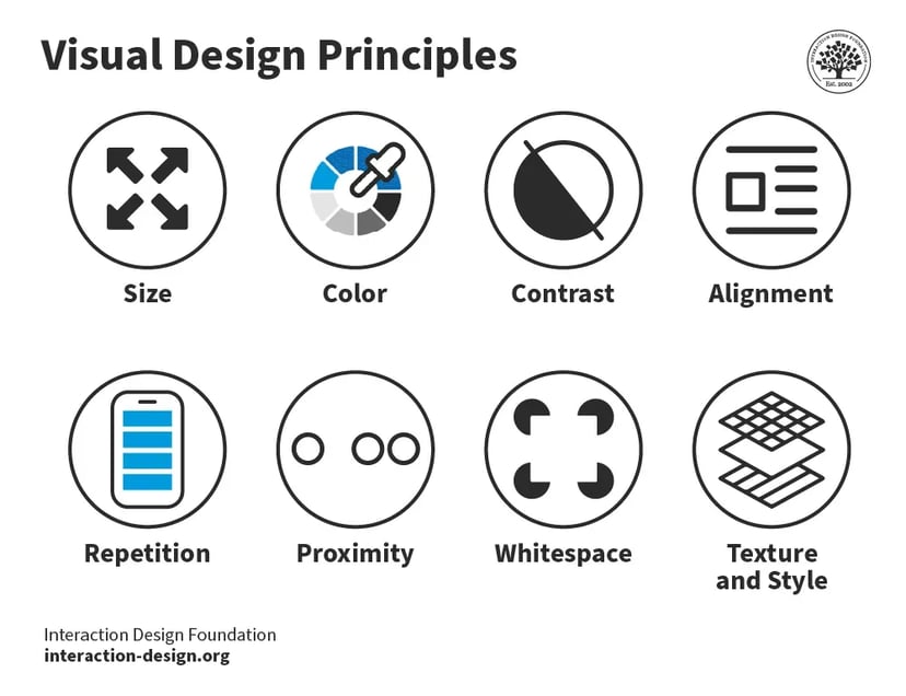
One critical method for mastering composition is understanding and utilizing the Visual Design Principles.
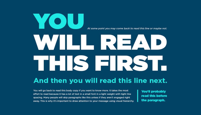
Look at this image and notice how your eyes move across the elements in the exact order. They are not in a typical order but thanks to these principles the designer guides you through the screen as he wants.

Now, you are the designer and you want to guide the reader in a way that you want.

Larger elements draw more attention because they are easier to notice.
In thumbnail design, the main object should be large. It should be big enough to be recognized instantly. Thumbnails are often viewed at small sizes on mobile screens. For example, if you're making a thumbnail for a video tutorial on Photoshop, show the Photoshop logo or a big feature like the Brush Tool.
Bright colors can enhance the attractiveness of your design. Using bright colors for key elements helps them stand out. It's a good way to grab the viewer's attention fast. For instance, a bright red ‘Play’ button on a video mockup can make it more inviting. However, ensure the colors also align with the mood and tone of the content.
High contrast between elements makes them distinct. It also improves readability. This is especially important in thumbnails, where text needs to be readable at a glance. For mockups, use contrasting colors. They make background and foreground elements stand out. This ensures that key features are highlighted. A black text on a white background is a classic example. It shows good use of contrast.
Proper alignment creates a neat, ordered appearance, making the design easier to navigate. Misaligned elements can draw attention if something is wrong. But, alignment should guide the viewer smoothly. For thumbnails, align the text left or center. Choose based on the image's background. This will ensure clarity and beauty.
Repetition can unify a design and establish an understanding of associated content. Repeat design elements to create a visual rhythm across products. This rhythm also fosters a sense of relatedness within a series. For example, using the same font type and color scheme across all thumbnails for a product series can show brand consistency.

Even though colors are different, repeating the same style across thumbnails conveys rhytm.
Elements placed close to each other are perceived as related, making the overall design feel organized. In thumbnails, group similar items or related text together to help viewers make connections quickly. For example, placing a title next to an author’s name. This is better than putting them on opposite sides of the thumbnail. It helps viewers immediately see the relationship.
Also known as negative space, whitespace helps to prevent a design from becoming too crowded. It focuses the viewer's attention on the main elements. More space around the title or key graphics in thumbnails can enhance visibility and reduce viewer fatigue. For mockups, using whitespace around a product image can draw the viewer's eye. It draws them to the product without distractions.
Textures can add depth and a tactile element to designs, making flat visuals more dynamic and interesting. Subtle textures in the background of a thumbnail can make it pop. They work better than a flat, single-color background. Similarly, in a mockup, adding a paper texture to background elements can make them feel more organic and accessible.
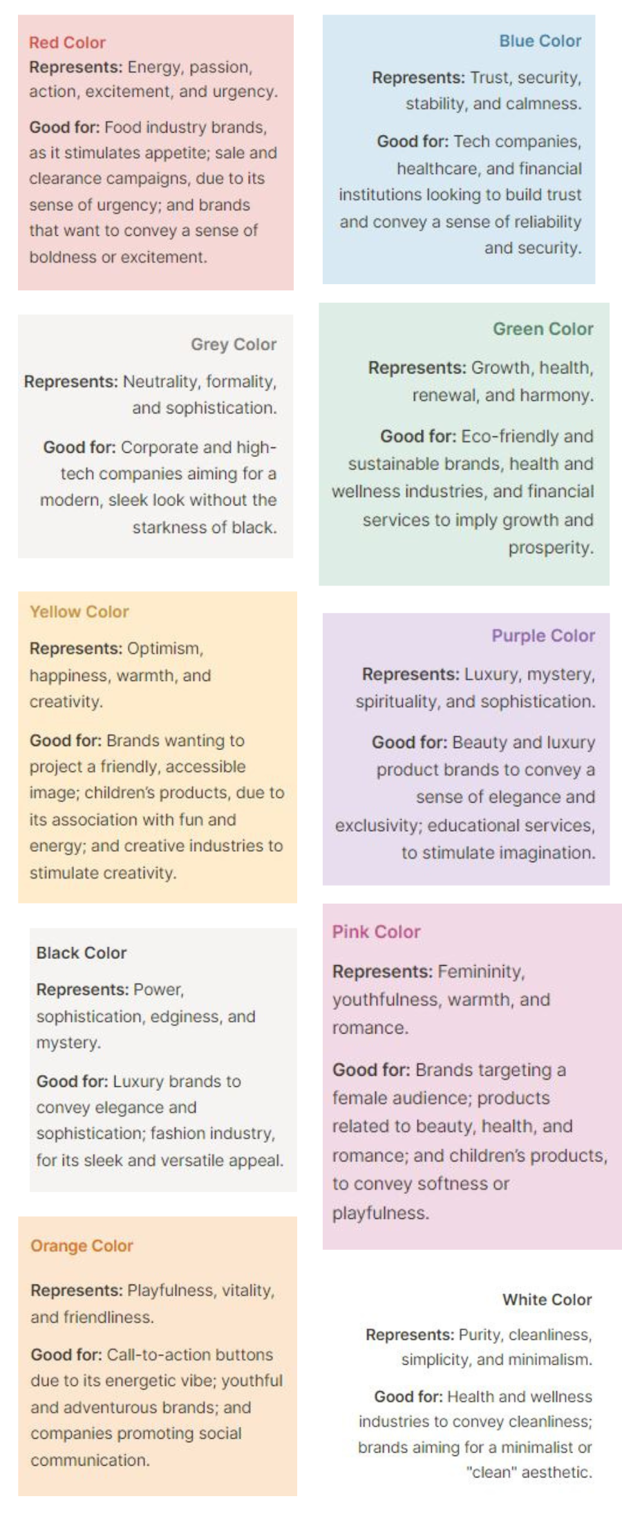
Color theory is crucial for designers. They want to make a statement and stand out in a tough market. Colors have the power to evoke emotions and set the tone of a design. Understanding color theory means more than just choosing nice colors. It also means knowing how to combine colors. This creates desired mental impacts and builds brand identity. For example, blue can evoke trust and calm, while red might energize and excite. Using color strategically can affect consumer behavior. It can drive engagement and help a product succeed.

You can read more about how different colors subconciously affect the perception of your brand and your visuals here.

